Yelp Trip Planner
2023
Yelp’s latest feature! Plan and share your next trip with Yelp.
OVERVIEW
Methodologies:
Interviews
Affinity Mapping
Persona Development
User Journey
Competitive Analysis
Persona
Problem Statement
Feature Prioritization
Style guide
Lo Fi Sketching
Wireframing
Lo fi proto type
User Testing
Hi Fi Prototype
Duration: 2 weeks
Tools: Figma, Maze, Google Suite
My role: Lead UX Researcher, UX/UI Designer
Team: 2 UX/UI Designers (Paul Taylor, Kayla Hardaway)
Project Brief
People use Yelp to find all sorts of things—especially when they’re on vacation and in an
unfamiliar place. Yelp wants to expand their offerings to be the go-to place for travelers planning
their trips. They would like to have a feature that allows users to create itineraries for their travels,
as well as a record of their actual experiences.
*Must be responsive for desktop and mobile devices
Research:
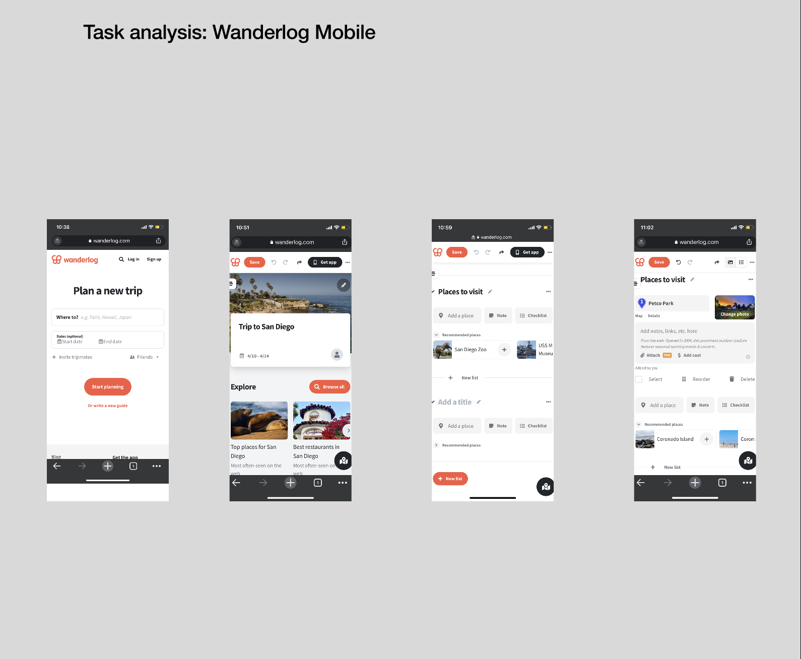
For our research we decided to interview 5 avid travelers. We also researched 4 other trip planning sites and created a task analysis for the 2 sites most similar to our target goal website.
The websites we decided to research were RoadTrippers, Wanderlog, TripIt, and Google.
Wanderlog Desktop:
Wanderlog Mobile:
Roadtrippers Desktop:
Roadtrippers Mobile:
Persona:
From our research findings, we synthesized the data into a single fictional character. Rainn Miller, our user persona, helps keep the team focused on the user and ensures the design solutions are user-centered.
Bio:
Rainn Miller is a school teacher. He enjoys taking trips during his school vacations. He is 28 from Oregon and consider himself a “foodie”.
He is looking for a one stop website where he can plan his travel itinerary on his laptop and phone.
Goals:
Wants to find a website that will not overwhelm him and is easy and intuitive to follow
Wants to plan a trip to San Diego
Problem Statement:
Rainn needs a one-stop shop for planning his trips. He tends to get overwhelmed with the amount of information and how it’s provided when using the current solutions in the market. He would also like to be able to record moments while traveling and share them easily with friends and family, whilst in the knowledge that his personal data is safe and secure.
Sketches:
Style Guide:
Wireframes
Desktop:
Home page
Where to
Itinerary/ Explore
Mobile:
Home page
Explore
Social Gallery
Usability Tests
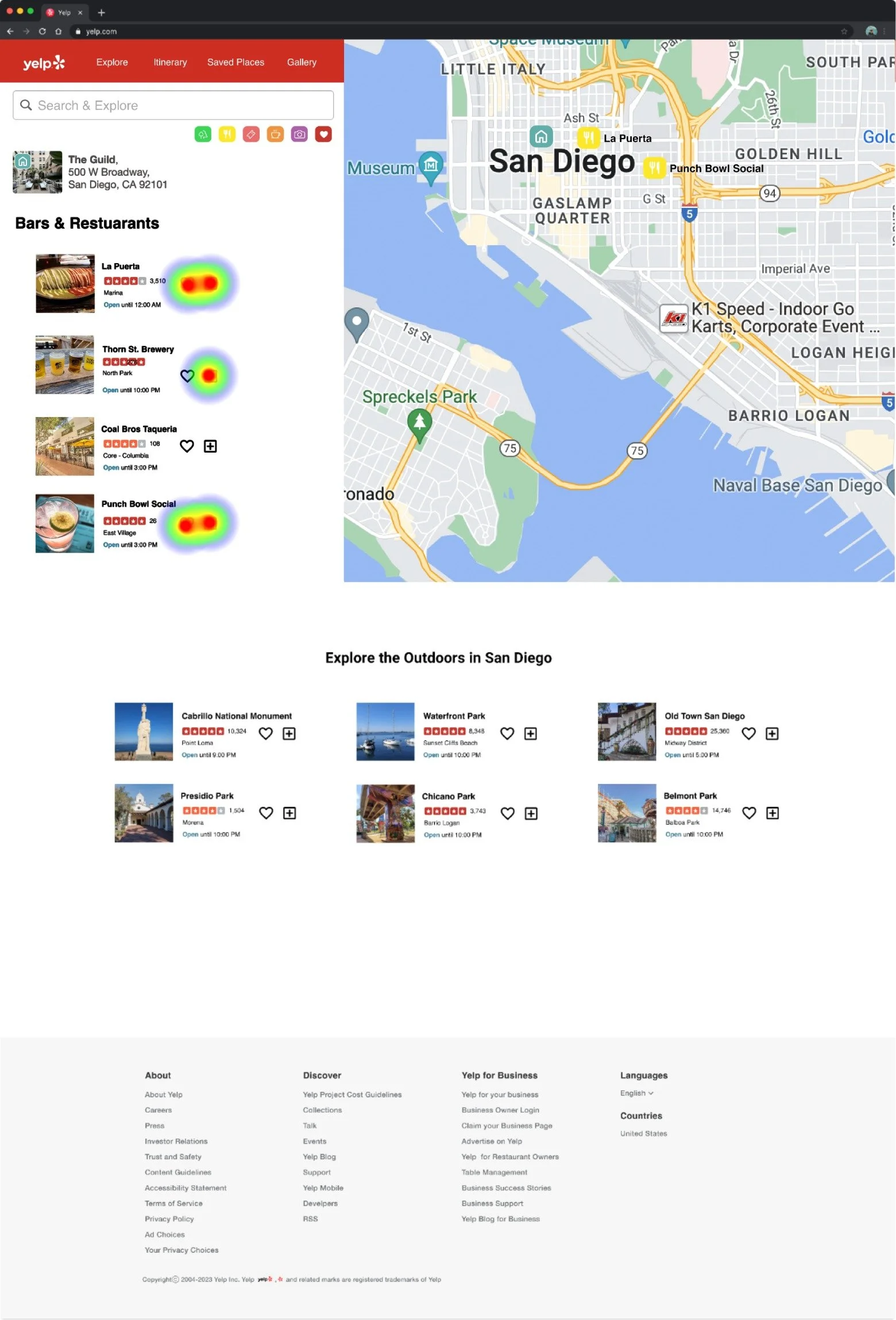
The goal of testing the mid-fi prototype was to see if it is intuitive and if it addresses the main concerns. Additionally, it is important for the users to guide our design decisions. We found that we have 2 screens we can improve.
We had 6 participants.
77.8% misclick rate
Here we tasked user to find what is planned for day 1.
Going forth we planned on making the itinerary easier to find.
Screen 1
Screen 2
80% misclick rate
Here we tasked user to find a closer restaurant to the designated day’s activities.
Going forth we planned to make the map and destination details easier to find.


